brand
medical aid for palestinians
Brand refresh for UK based charity working on the frontlines of Palestine, Lebanon and the West Bank.
The Brief
MAP's identity had accumulated inconsistencies over the years. There was a clear lack of a graphical system throughout the brand. The core brief was to refresh and realign MAP's brand identity whilst maintaining an instantly recognisable look, so people working on the ground could easily identify it. As well as preserving in some form the original "A", a mark that traces back to a wall marking from the charity's founding.
creative direction
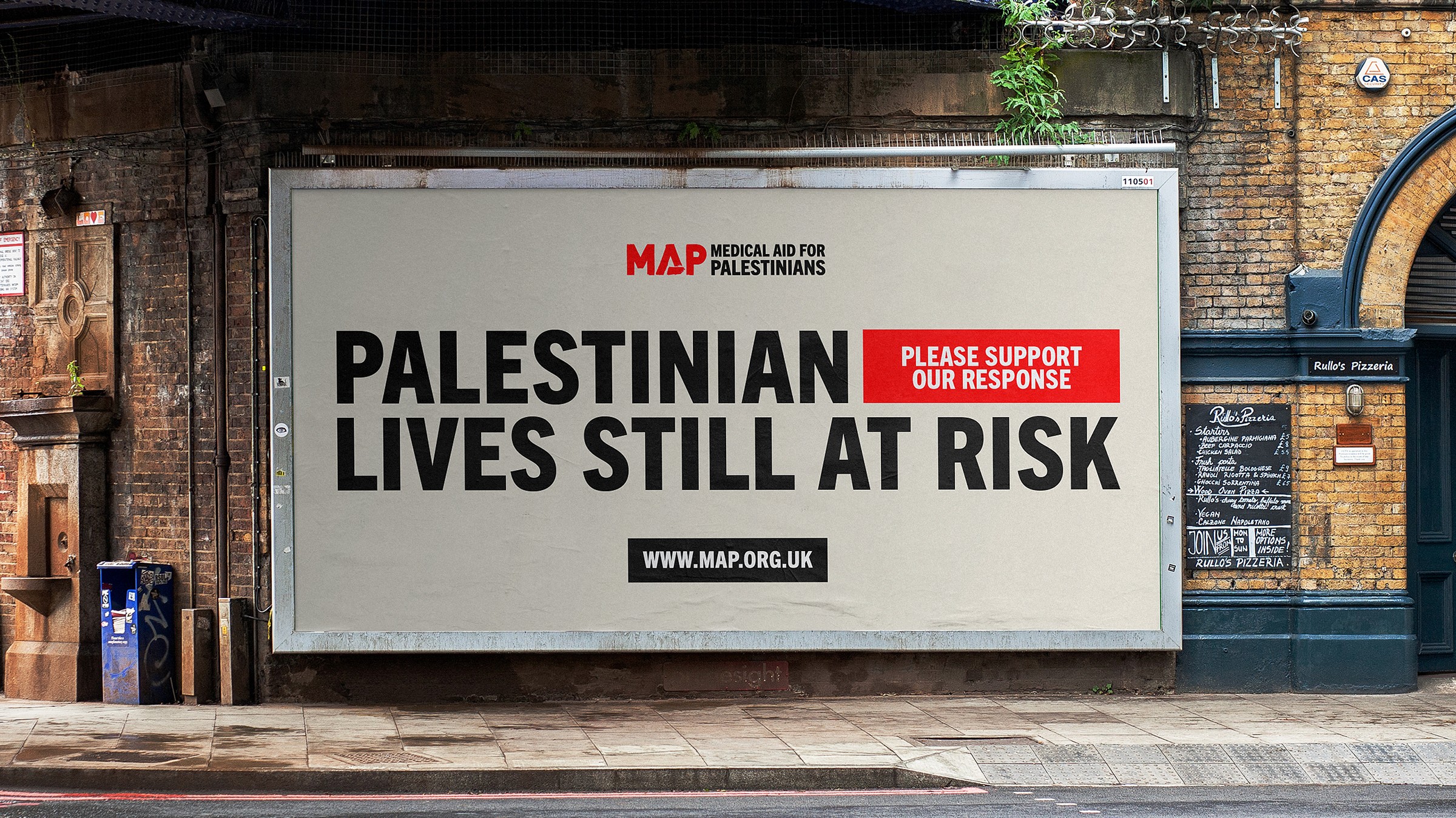
MAP's visual system is rooted within Palestinian culture. Framing devices were created from shapes found within Palestinian tapestry and architecture, giving them an identifiable and familiar feel to the people who interact with the brand most. The colour palette keeps the recognisable core red from the previous identity whilst introducing warm and familiar tones synonymous with the region, allowing MAP to communicate a range of emotion through different forms of content.


Typography & Iconography
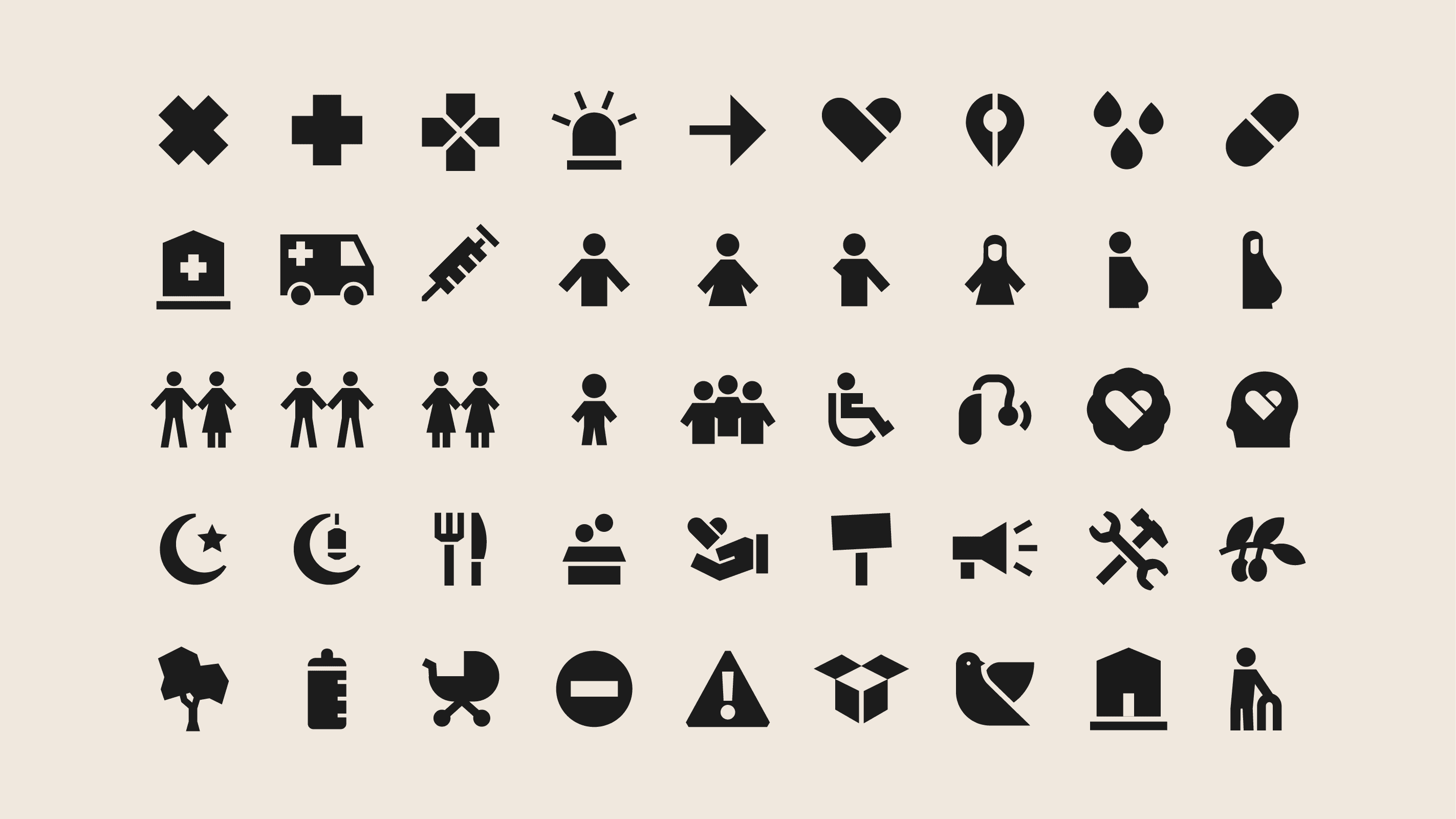
Trade Gothic Next was chosen as MAP's core typography, as its extensive family offers a vast amount of flexibility in tone, which was perfect for MAP when communicating across various audiences, whilst maintaining a unified visual style throughout. The iconography maintains a similar aesthetic to the typography, making use of chunky forms and negative space.