brand
bolton family hubs
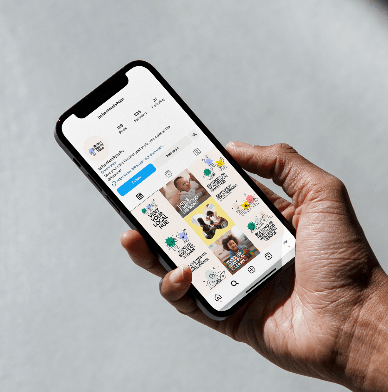
A joyful & characterful brand system for Bolton Family Hubs. A service offering support to young families around Greater Manchester.
The Brief
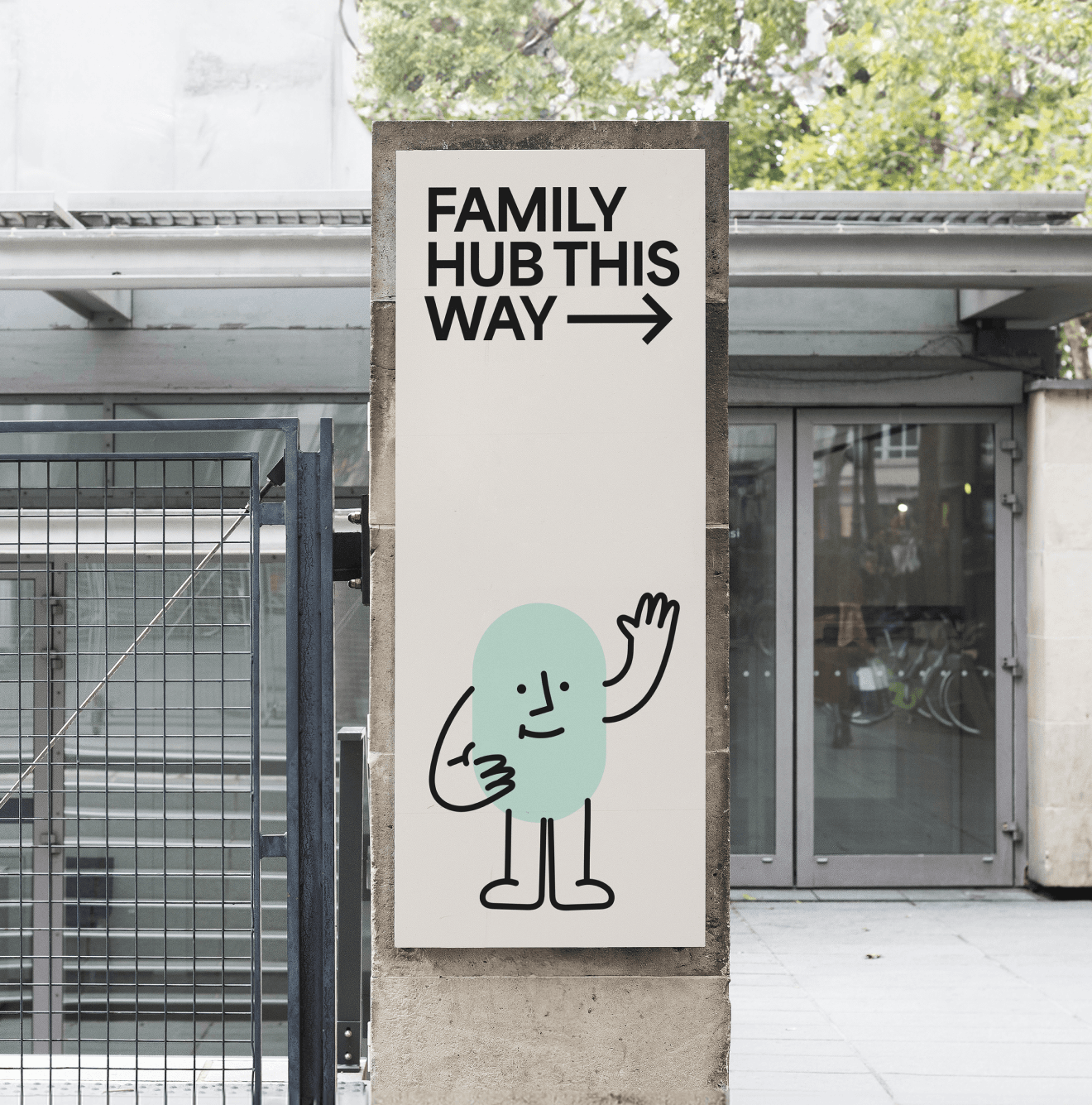
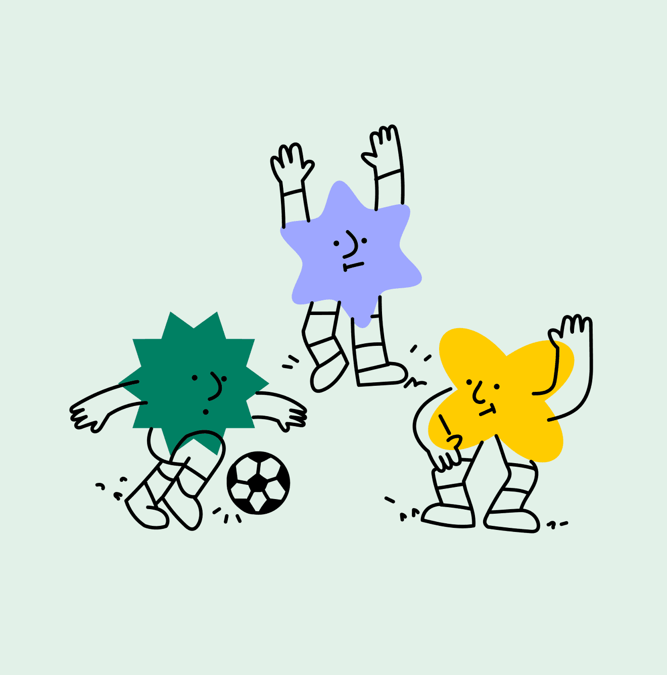
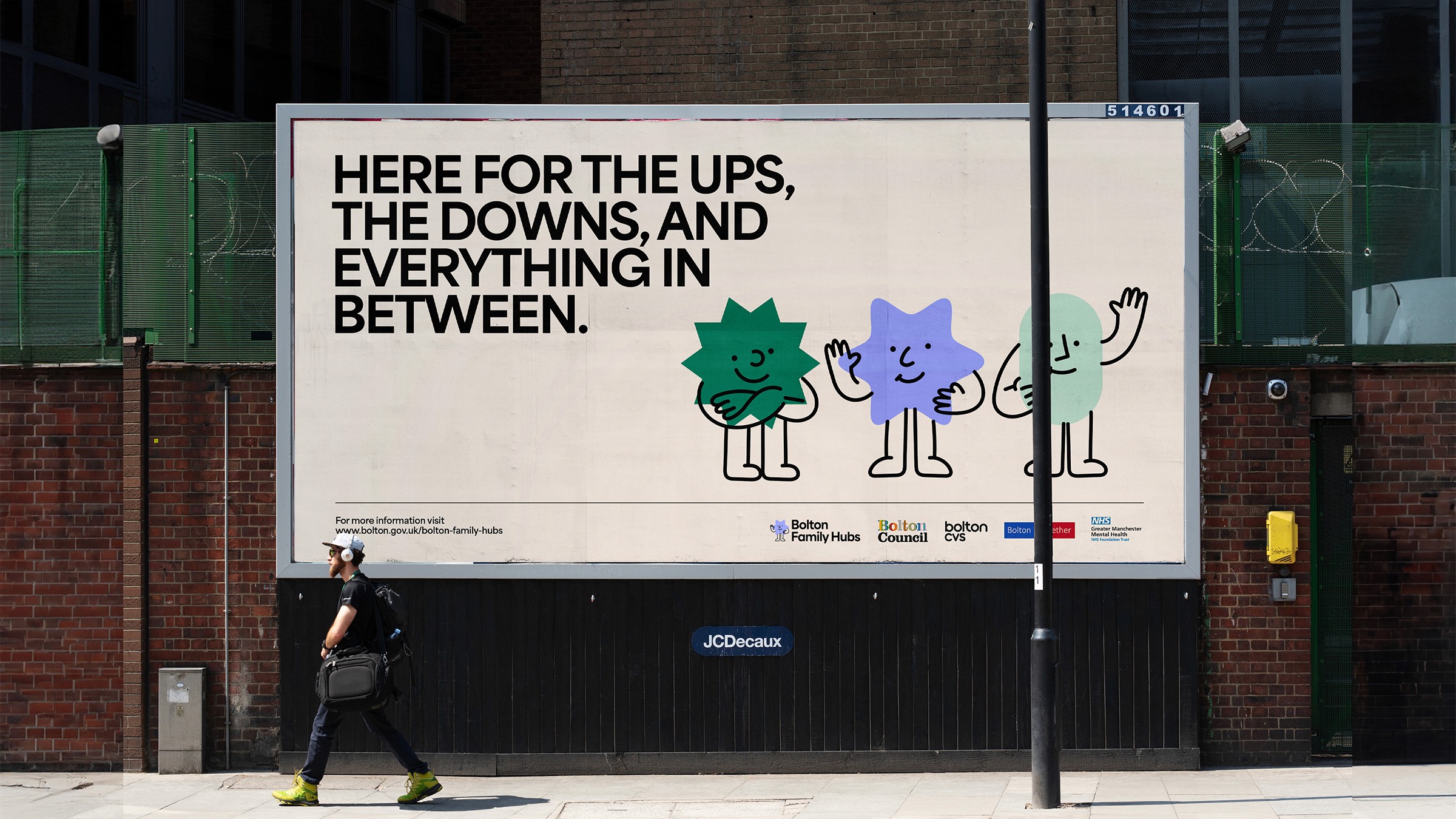
Bolton Council needed a warm and welcoming brand for their new offering, Bolton Family Hubs. The BFH brand’s core is built around emotive geometric shapes and friendly characters. It was designed to be as inclusive as possible, so everyone feels welcome and as many people as possible are encouraged to access the help they need.

creative direction
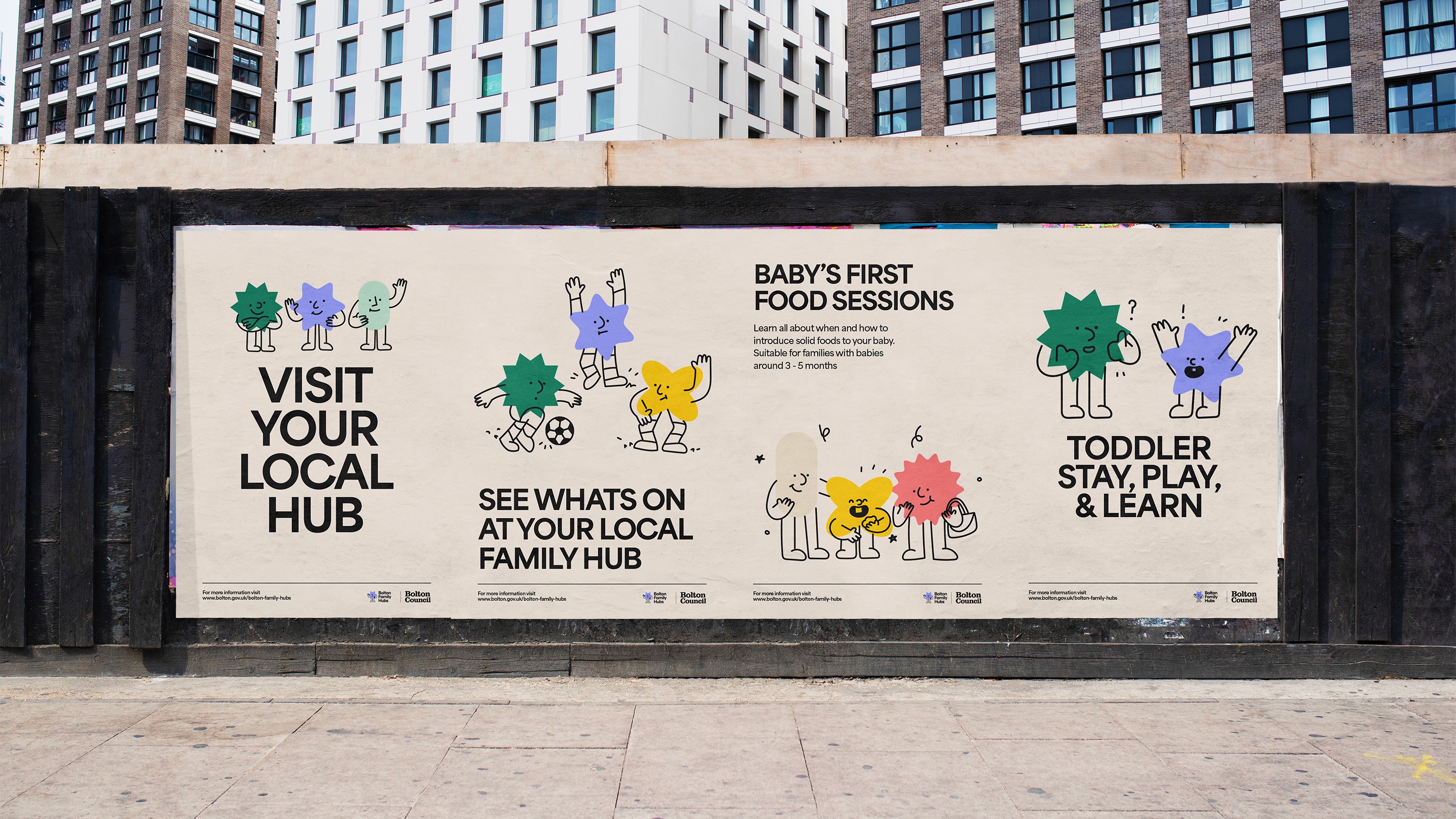
Characters and typography play a major role in the overall brand system. The core geometric shapes used throughout the identity form the bodies of the characters, and also frame photography where needed. Bright and pastel colours make up the brand’s colour palette, always with an overprint style for the characters. Off-white is the brand’s primary colour, ensuring a warm and welcoming feeling across all applications.